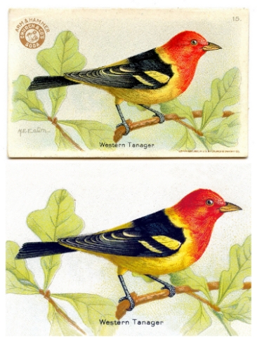
I found a wonderful range of vintage Arm & Hammer advertising artwork featuring different birds. I’ve removed the original branding and any excess text and generally cleaned them up to make clean, bright and simple notecards. Here’s one I retouched earlier:
Butterfly beauties
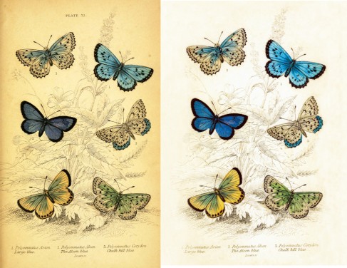
I found a beautiful range of butterfly illustrations on the vintage printable website. Here’s a ‘before and after’ image of one I worked on earlier:
First I printed it and re-scanned it at 1000 dpi. Then I removed some of the yellowness from the background and generally lightened it to allow the butterflies to be the main focus point of the image. I also removed the darker shadows around the edge of the image using the burn tool.
I plan to do a set of these, I think they’ll make lovely note cards.
A vintage American farm supply advert becomes a ‘painting’
I found this unusual advert for Plano, an American farm supply company (by the looks of it) at The Graphics Fairy blog. Hats off to Karen, the very generous woman who runs the blog and makes scans of her vintage image collection available to all to be used in crafty projects. If you like vintage images then she’s definitely worth a visit.
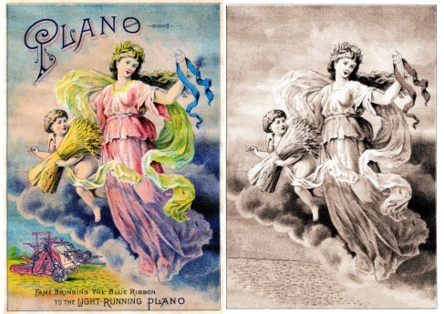
The original image is very colourful, has branding text at top and bottom and a picture of a tractor in the background. I love the picture of the very classical looking woman that dominates the foreground, to me she’s a cross between a painting and the statue of liberty. After pondering the image for a while I could see a muted but beautiful ‘painting’ waiting to emerge – so I set to work in GIMP. Here are the before and after images.
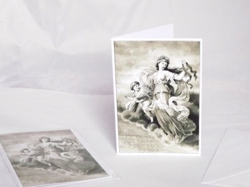
It took a good few hours to carefully remove the text and the tractor image and patch up the background using the clone tool. Although I love the original colours I definitely had a low-colour sepia style in mind so I colourised and desaturated until I got the right effect. She looks awesome as a notecard:
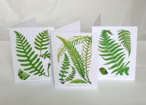
More fern cards
British fern
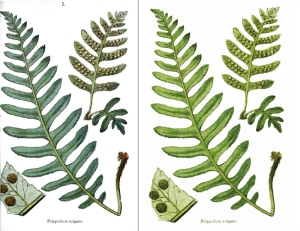
I found a wonderful range of British fern botanical images on vintageprintable.com – a brilliant website packed full of curated vintage images. The image is taken from an 1861 book titled ‘Popular history of British ferns’.
I printed the downloaded digital image and then scanned it at 1000dpi to give me a decent image resolution. Then I set to work on it. Here is a before and after comparison:
I removed a shadowy line to the left of the image and rebuilt a small section that was missing from the bottom left hand area. I’m very picky when it comes to image composition so I shuffled it around slightly, making the overall image wider and the different elements feel better balanced. Finally I worked on the colours using curves, hue/saturation, colour balance and levels.
I’m very happy with the finished image and it prints well at A4. I’m also going to use this image on note cards – maybe I’ll make a small set of these with some different fern images.
Welcome
Hello and welcome if you’ve found your way to my little vintage quirky corner 🙂

